
In this Case Study, I've explained the approach that my team and I went through at morphosis when working on JP Morgan website. In this project, I started of as a associate designers but in the later stage as the lead designer left Morphosis I was given the opportunity to lead it.
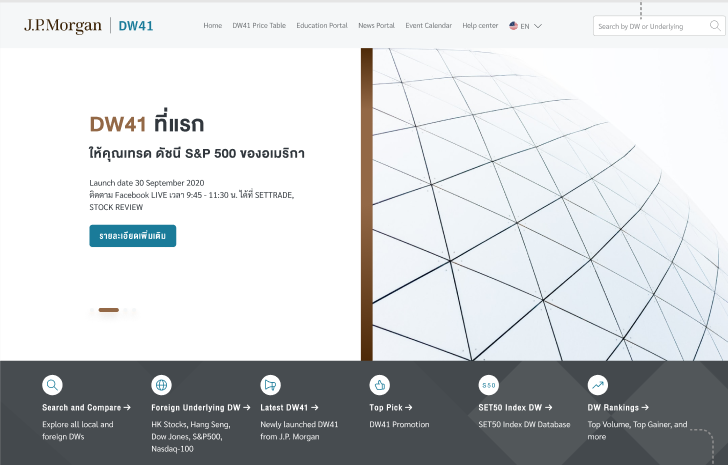
J.P. Morgan is a global leader in financial services, offering solutions to the world's most important corporations, governments and institutions in more than 100 countries.
How might we design a website with improved user experience and what additional features might we offer to help us better compete with the competitors as well as cater the needs of a beginner in trading Derivative warrant?
In order to improve the current websites User Experience we redesigned it completely while keeping both users and business goals in mind. We focused on introducing new feature while also improving the experience of some old features.
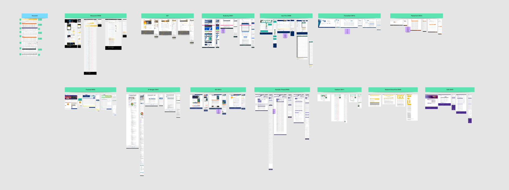
During our research, we did comparator benchmarking of 13 different comparators while comparing the key flows as well as different features they offered to users.

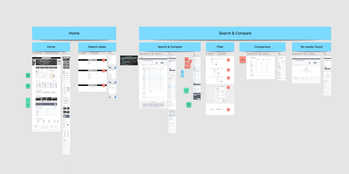
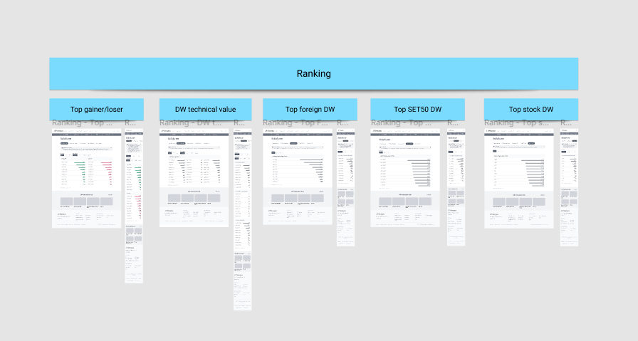
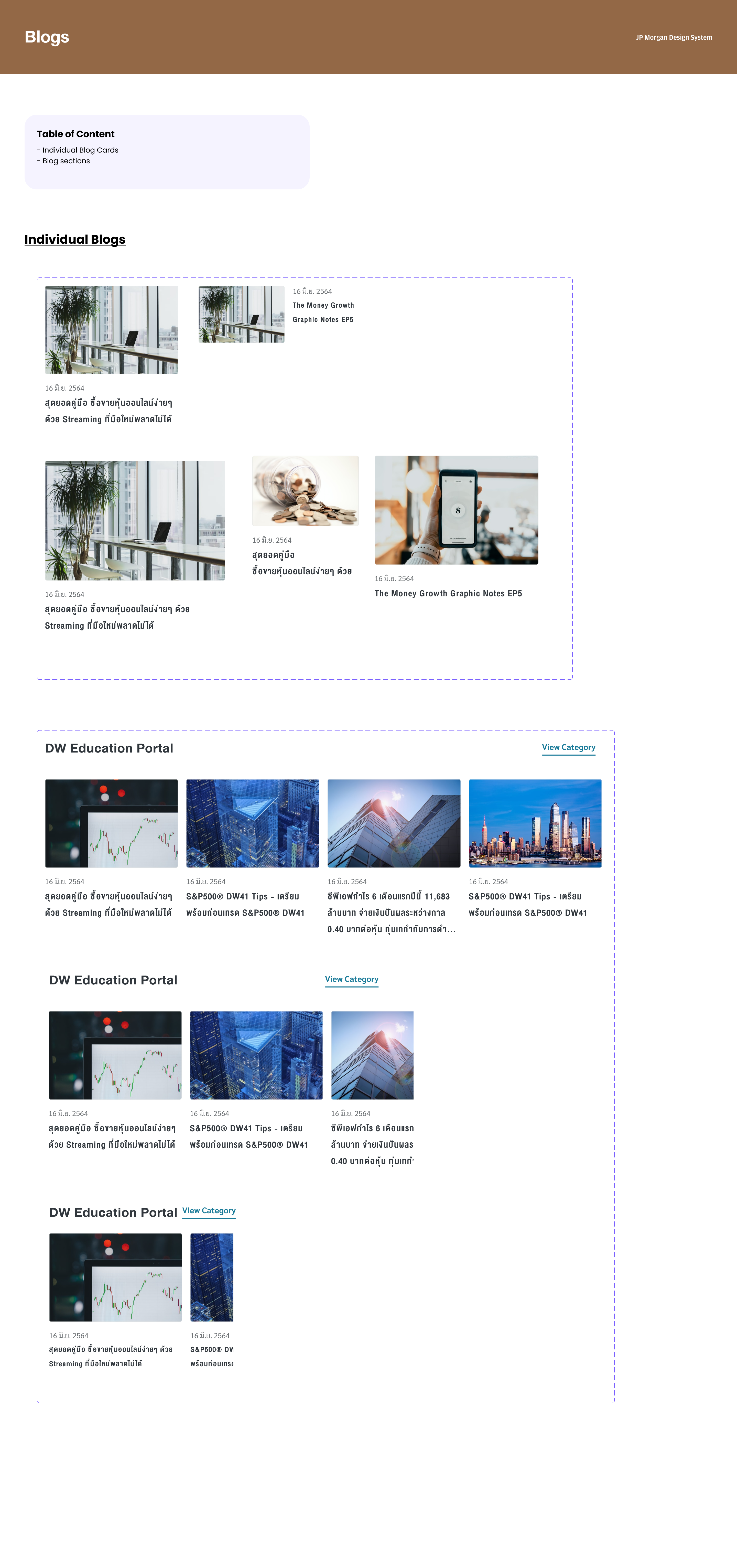
High fidelity wireframes of few of the many flows.
After the design was made we needed to test it with actual users to validate our design and see if our designed product is actually solving user problems or not. the tool we used for this process was Lookback.io as the test was conducted during Covid-19 peak times and we needed to test remotely.


Redesigning AXA Thailand's insurance website to reduce friction and optimize the purchase flow across Travel and Motor insurance products.

Designing a dual-platform meeting ecosystem — from stakeholder discovery to high-fidelity UI — to help teams run more focused, productive meetings.


