

AXA Thailand offers a range of personal insurance products — including Outbound Travel and Private-car (Motor) insurance — primarily sold through their direct website. With a significant portion of users coming from mobile, the website serves as a critical sales channel, making conversion rate optimization essential to business growth.
AXA's business goals were clear: increase revenue from the online channel and grow market share in Travel (50–60%) and Motor (30%) insurance. However, the existing website had significant usability issues, unclear value propositions, and purchase flows with too many friction points — leading to low conversion, especially on mobile.
We applied three complementary research methods to build a complete picture of usability issues and competitive gaps. Findings were cross-checked and combined to deliver data-informed recommendations.
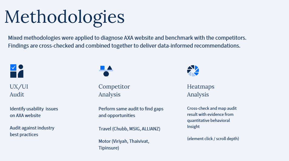
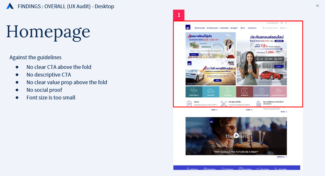
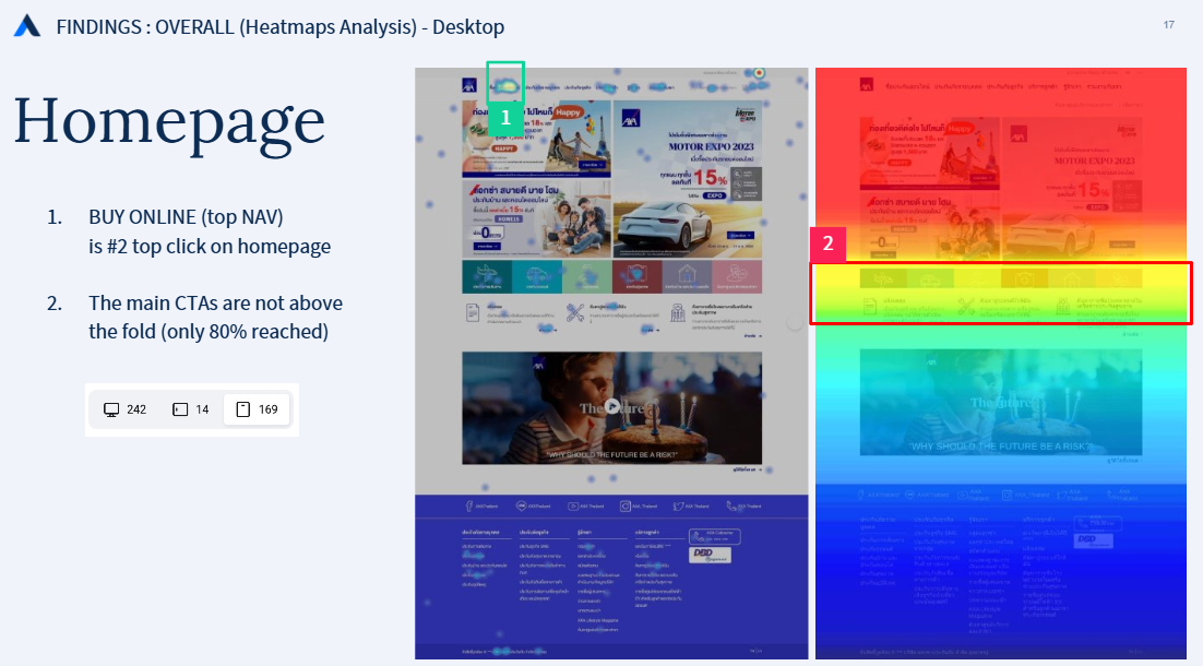
We audited AXA's website against industry best practices — covering the homepage, navigation, product detail pages, and purchase flows for both Travel and Motor. Findings were validated with Hotjar heatmap and click data.
We mapped the full purchase flow of six competitors — Chubb, MSIG, Allianz (Travel) and Viriyah, Thaivivat, Tipinsure (Motor) — and scored each against industry best practices. This revealed where AXA needed to close gaps and where it could leapfrog the competition.
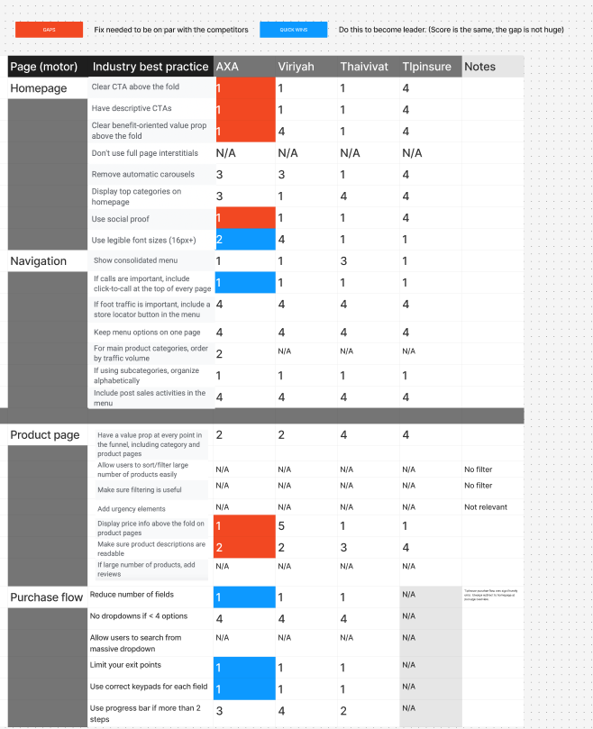
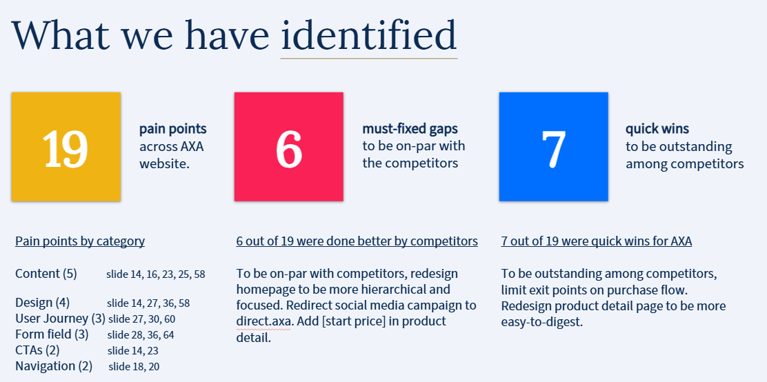
Key gaps identified: AXA was missing price visibility above the fold on product pages, had too many exit points in the purchase flow, and used incorrect keypads for numerical form inputs — all areas where competitors were doing better.
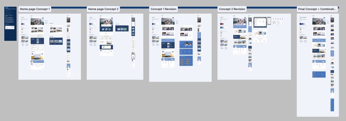
With research findings consolidated, we moved into wireframing. We explored two homepage concepts — each addressing the core issues of hierarchy, value proposition clarity, and product focus — before iterating toward a final combined direction.
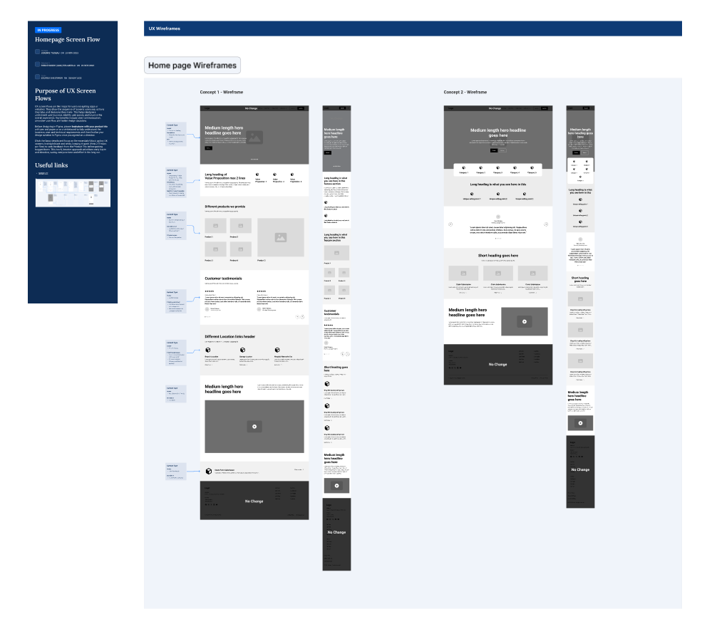
We explored two homepage concept directions, revised each based on stakeholder feedback, and combined the strongest elements into a final concept. The redesign prioritised a clear value proposition above the fold, benefit-oriented content, and visible product CTAs.
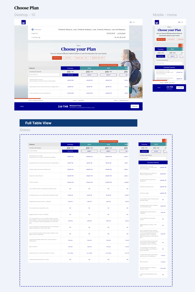
For the purchase flows, we redesigned both Travel and Motor journeys with limited exit points, optimised form fields, and clearer plan comparison layouts — directly addressing the drop-off points uncovered in research.
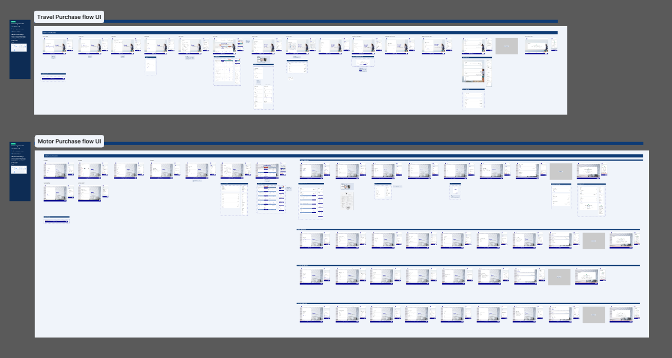
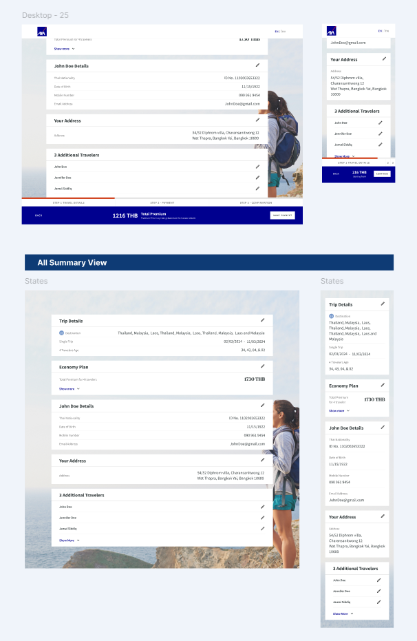
The redesigned travel flow introduced a clear plan comparison table with visible pricing, streamlined traveller detail entry, and a clean summary screen — reducing cognitive load and exit opportunities at each step.
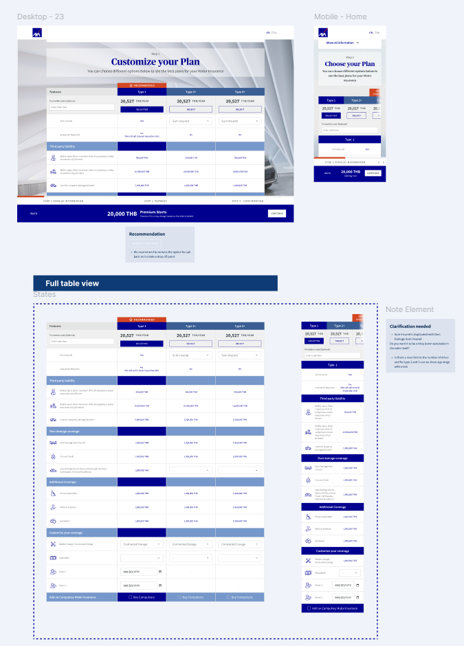
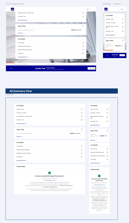
The motor flow was redesigned to lead with vehicle information before personal details (matching competitor best practices), limit exit points throughout, and present a cleaner plan selection experience with starting prices shown upfront.
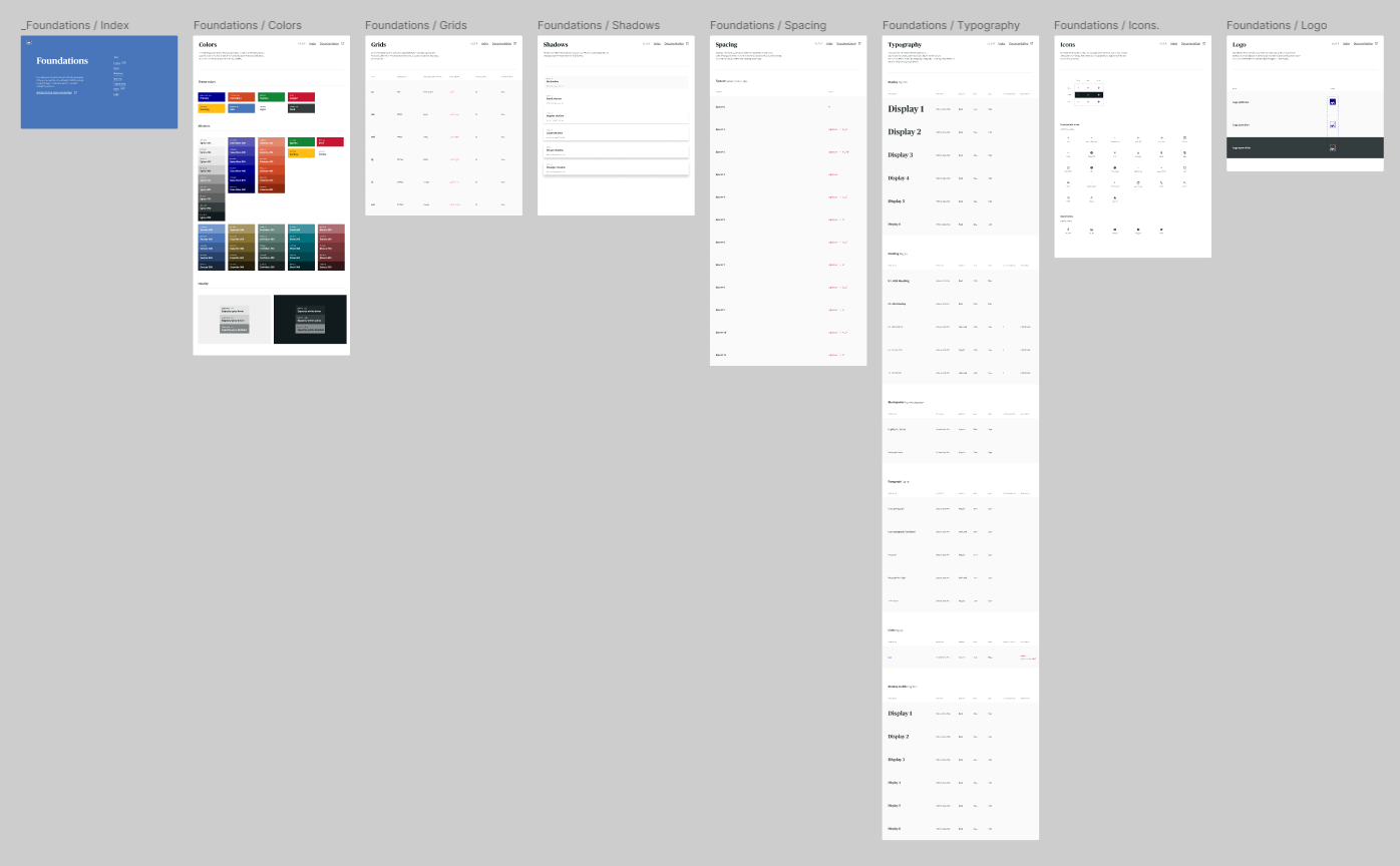
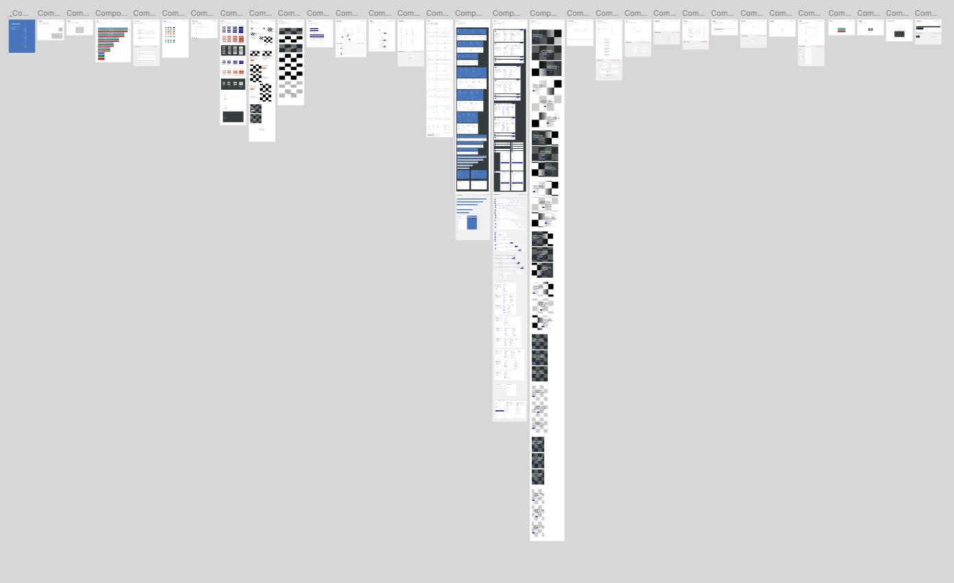
Alongside the purchase flow redesigns, we built a dedicated design system to ensure visual and interaction consistency across both Travel and Motor insurance products. The system was grounded in AXA's existing brand guidelines and extended to cover every UI pattern needed across the two product lines.
The design system served as a single source of truth for the team — covering typography, colour tokens, spacing, iconography, form components, buttons, and content blocks. Every component was built with responsiveness in mind, with documented desktop and mobile states to support the mobile-first optimisation goal of the project.
Colour tokens, typography scale, and spacing rules mapped directly to AXA's brand guidelines, ensuring every screen felt native to the brand.
Shared components — buttons, form fields, plan cards, progress bars — were used across both Travel and Motor flows to create a unified experience.
By establishing the design system in Phase 1, we reduced design decision-making in later stages and gave the development team clear, documented specifications to build from — directly supporting AXA's goal of a faster, higher-quality product delivery in Phase 2.
Phase 1 delivered a comprehensive UX research report and redesigned UI for both Travel and Motor purchase flows. The work surfaced 19 pain points, identified 6 must-fix competitive gaps, and defined 7 quick wins. The findings and designs directly informed the Phase 2 development roadmap, with a clear prioritisation of mobile conversion optimisation as the primary objective.

Designing a dual-platform meeting ecosystem — from stakeholder discovery to high-fidelity UI — to help teams run more focused, productive meetings.

Redesigning a leading Thai IT company's corporate website to simplify navigation, improve service clarity, and deliver a polished, user-centered experience.


